Online Competition - September 2019

A boys story
by Rosie de Jager

Mooi foto van seun met hasie. Die uit fokus gashalms in voorgrond pla bietjie
Agteroor manauver
by Neville Hein

Good exposure on the three subjects. Pefect shutter speeds showing movement in the propellers. The planes are slightly unsharp. Good composition
Abigail
by Dricky Gouws

Nice pose & composition,sharp handled the light subject matter against black back drop well.Tone the chest area down to draw attention to face.,
Bee Free
by Chris Bester

Well captured macro shot! I would have liked to see the bee more head-on, rather than his backside. White spot on top right could be cropped out. I find the image a bit too contrasty. Large gree ou of focus leaf is too bright and can be toned down
Cape Town Stadium
by Pine Pienaar

Good comp.all roads leading to stadium,not too cluttered,nice balance with the buildings at top and bottom,nice soft later afternoon light.
Elande
by Suzy de Beer

Die elande smelt saam met die agtergrond en kort meer kontras sodat hulle kan uitstaan. Die elande is baie klein in die foto, baie van die agtergrond bosse kan uitgesny word en dit sal die foto verbeter
Flags 2
by Chris Gouws

Good action shot with dirt flying! The riders could be brightened up a bit especially his face and a hightlight in the horses eye will enhance the image
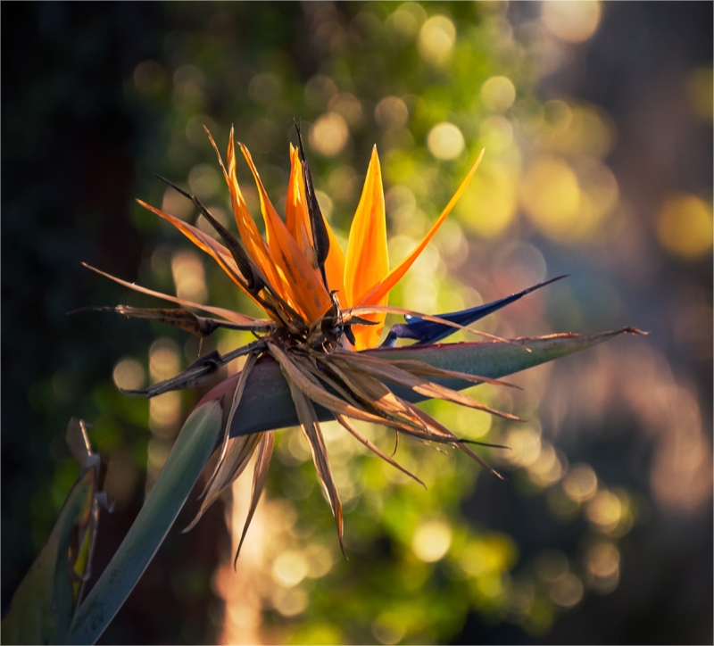
Flower in nature
by Mieke de Jager

Nice use of backlighting,makes the orange petal stand out,like the bokeh effect of the wider aperture but unfortunately this leads to a softer focus on the dead front petals.
Gina
by Deon de Jager

Good lighting and good pose. I dont mind that you cant see the eyes as that is part of the pose. The image needs more contrast as we need to see blacks and whites.
Hole in the Wall star trail
by Chanel Enslin

Excellent capture of the South Celestial Pole! I like the Hole in the Wall just visible, which shows excellent exposure. Extreme noisiness is the downfall of this image.
Kaptein span die seile
by Jan Jacobs

Captures the feel of the sea and age of the sailor in his face and cap,nice use of the low angle to include the seagulls.Take out the cut off bird in the top left and on the right hand side.
Mother baboon drinking water
by Johan Brits

The subject is very sharp and the coloiurs are natural.The mass of water is too much and about a third of the water can be cropped off and one will still see the reflection. If we could actually see the baboon drinking the photo will be improved
Moving waters
by Renee Storme

I like the muted pastel colours of this image, but I think the sky could do with a bit of darkiening and more saturation
Multiply
by Tom Prins

Good concept.like the use of colour.Feel that there is too much light (not over exposed) ,rather use a more subtle light. Clean all the white spots on the green base.
Stromlopie
by Mietsie Visser

Kostelik! Kon dalk bietjie nader ingekrop het en die foto in A4 formaat gemaak het.
Muskiet met druppel
by Rensia Fourie

Fantastiese poging! Ek gee nie om dat die een been uit fokus is nie, dit toon lewe in die muskiet.Die druppels is baie mooi skerp asook die res van die foto. Baie goeie makro poging
One two three go
by Elsje Vermeulen

Good example of the panning technique. I feel the background too bright and I think you could crop a biot off at the back and a lot from the top, making the car larger in the image
Shy
by Henk Scheepers

Like the pose of the arms & hands framing the face, good lighting,sharp.I would rather of had a full profile so that you do not see the small portion of her left eye and slightly tone down her side under the arm.
Spore
by Nicolaas Louw

Die titel is hier n probleem. AS sulks moet mens die spore wys en dan het jy n groot stuk strand met niks in nie. Ek sou op twee maniere die foto verbeter.Crop dit portret styl sodat net die spore en die visterman en deel van die berg in die agtergrond in die foto is. OF Crop meeste van die sand uit en noem die foto bloot visterman.. Gee effe kontras wat die foto is effe flat
Up there
by Haig Fourie

Great PJ, sharp, detail through out, tells the story of effort and strenth.
Wagtend
by Louisa Scheepers

Baie goeie makro poging. Die belangrikste deel, die o├ā┬½ is in fokus. Net jammer daar was nie groter diepteveld sodat meer van die onderwerp in fokus kon gewees het nie, dit sou n beter telling gegee het.
Zebra argument
by Koos Fourie

Goeie aksie! Die bekke vol tanne trek jou oog dadelik!
© 2019 VDBP-Photo.org.za. All Rights Reserved | Development by Why Web Developments
Design by W3layouts


